Certain postcards reflect a distinct over enthusiasm on the part of the colorist. The folks who like this Ned's Point Lighthouse example are evenly split between those familiar with the Mattapoisett landmark and those for whom vivid is everything. I fall squarely in the middle favoring the historic value as much as the aesthetic.

This Saybrook Light Postcard exemplifies that elan with an almost tie-dye sky behind a finely detailed B&W lighthouse. This particular light is featured in many collections of especially fine Connecticut Lighthouse postcards. The proximity of The River and brilliant sunsets were enough for any postcard photo creator from a century ago to feel the license to be a little extra with his shades and tints. It's also a show stopping cutting board. Just sayin.'

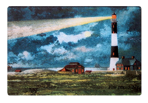
Fire Island Light's coloring shows wonderful, almost diorama like depth amid the brilliant hues. Every window visible is glowing. Black is used sparingly and the noticeable beam isn't over powering as is often the case with lighthouses at night postcards. This postcard demonstrates how much a colorist can add to a photo. This cutting board on a table or counter can't be ignored.

Many postcards printed in late 19th Century Germany used coal-based inks developed by firms like IG Farben. They offered a tinting in skies and seas that became a standard.

